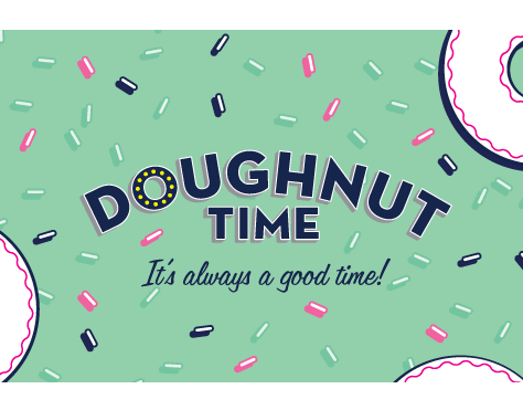
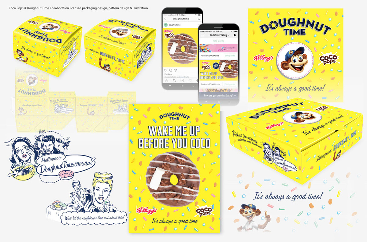
COCO POPS X DOUGHNUT TIME
ILLUSTRATION • GRAPHICS • PACKAGING • BRANDING • 2017
Graphics and illustration prepared for Kellogg’s Coco Pops by Doughnut Time Collaboration. Using core Kellogg’s Coco Pops imagery and applying with Doughnut Time’s playful attitude. I also created custom vintage style illustrations and a pattern featuring Coco Pops with doughnut sprinkles to decorate the core imagery of both brands for packaging and marketing collateral.

e3 StYLE • KREATIVE DNA
PRODUCT & MARKETING DESIGN • 2012 / 2013
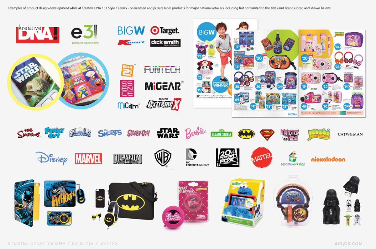
LICENSED PRODUCTS
As part of the creative team(2012 - 2013), I worked across various projects across product design and development and marketing design for licensed and private label tech accessories goods for sale in major national retailers.

CITY BEACH AUSTRALIA
BRANDING • MARKETING DESIGN • PHYSICAL STORES + ECOMMERCE • 2009 - 2010
MARKETING DESIGN
As part of the Marketing Department over the 2009 / 2010 period, I was responsible for the design of all marketing promotions, retail marketing collateral (bricks and mortar and online) as well as internal communications for major Australian retailer City Beach. One of my first tasks was to update the corporate logo as City Beach Surf Australia would drop ‘surf’ from the official name and continue as “City Beach Australia”. This change would also be accompanied by the transition into a new aesthetic look with the implementation of a new website and online channels as City Beach entered the online retail sphere.
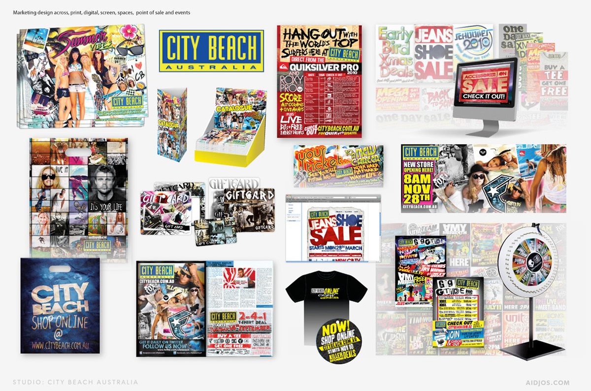
I designed marketing concepts signed off by my directors, which would be prepared for print and also for the online team to implement across all online channels and also to any external media agency partners to prepare screen media for in store TVCs and television ads. I also edited content, prepared motion graphics, designed point of sale ideas and graphics for display in all stores.
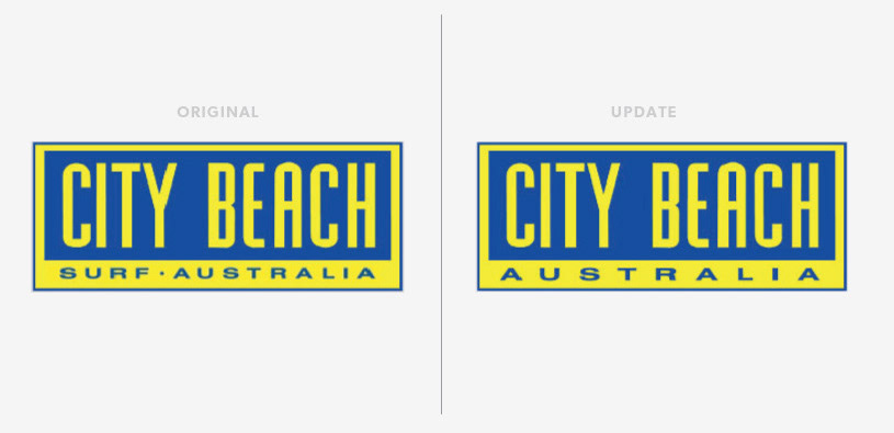
COMPANY LOGO UPDATE
As the company began to incorporate more streetwear there was a need to remove ‘surf’ from the logo. I was asked to make a small adjustment that would not detract from the original and familiar design.
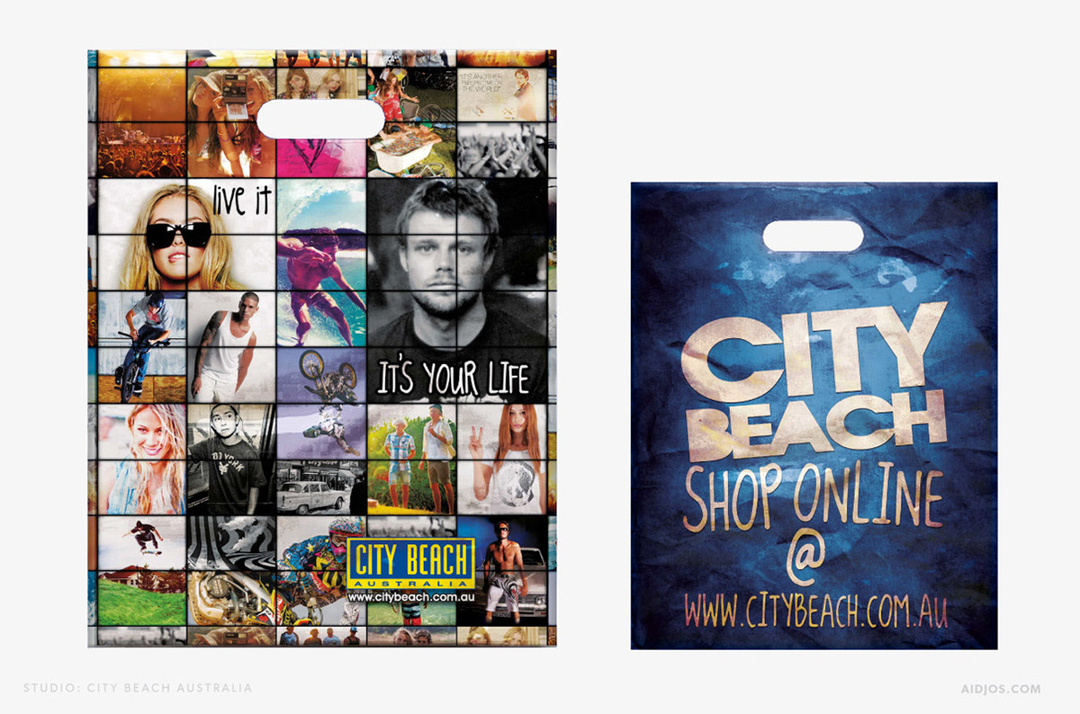
CORE CARRYBAGS
As the company began to incorporate more streetwear there was a need to remove ‘surf’ from the logo. I was asked to make a small adjustment that would not detract from the original and familiar design.

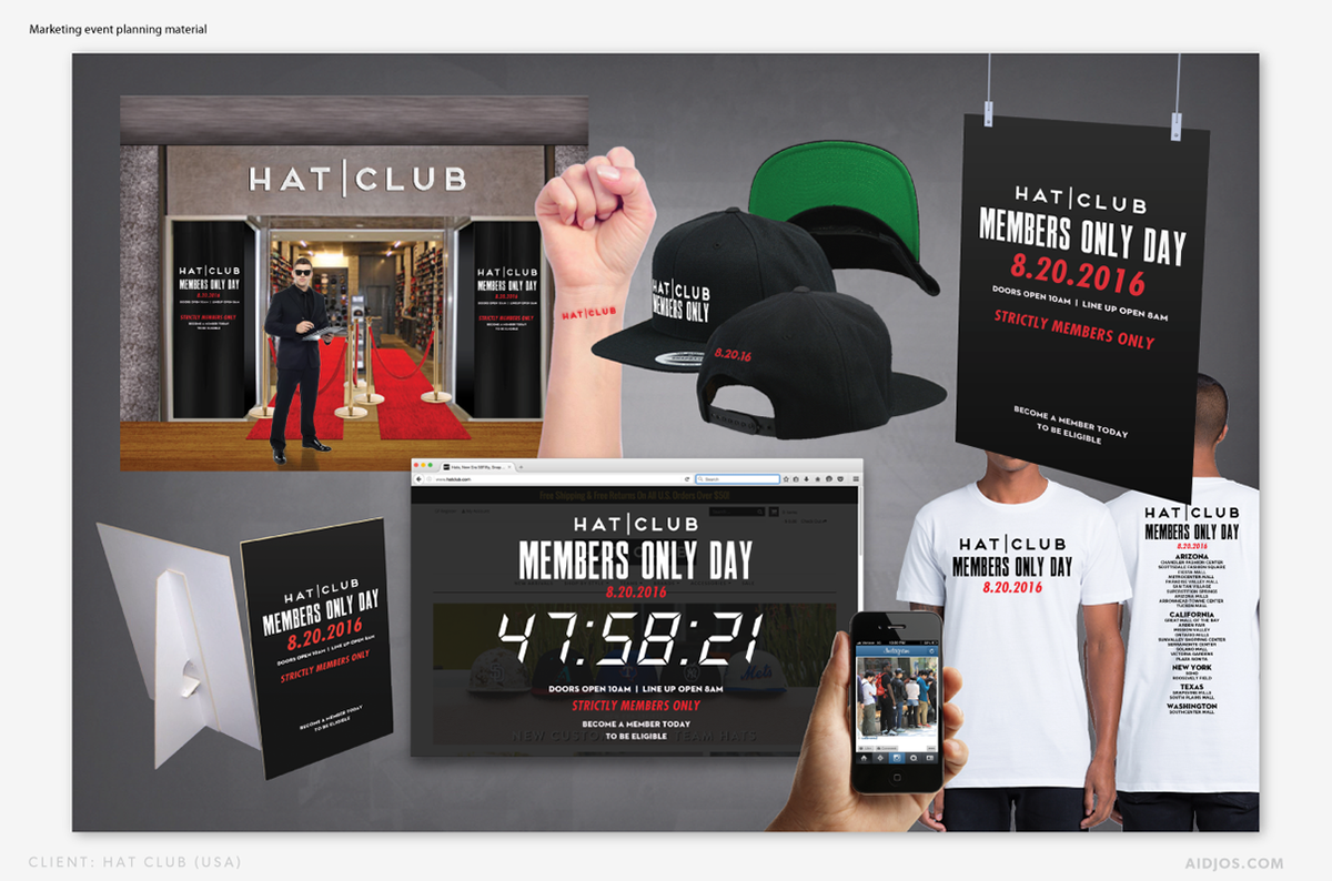
HAT CLUB USA
MEMBERS RETAIL DAY EVENT 2017
Mock up designs for store front VM and styling, wrist stamp, members merchandise, signage and web communication design on presentation material for store level instruction.

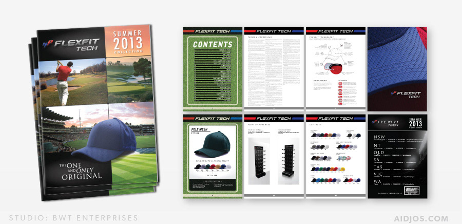
FLEXFIT TECH
BRAND DESIGN • CATALOG DESIGN • PRODUCTION • 2013
Shown below: Catalog layout design, graphics, image sourcing and print prep for 2013 Summer catalog. Shown below, are sample pages from the 42 page catalog exhibiting some of the main layout styling.

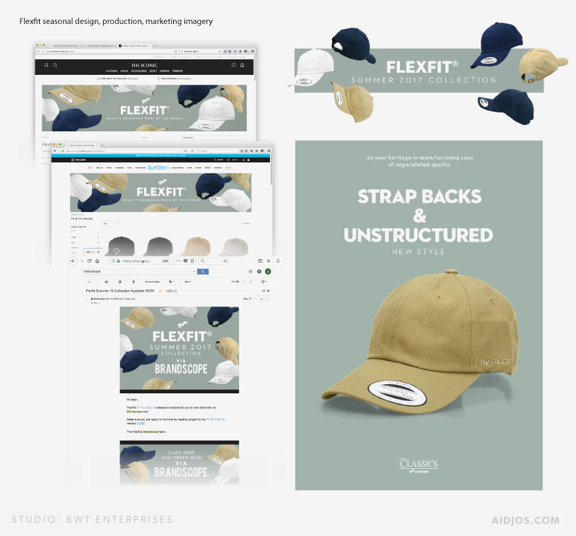
FLEXFIT HEADWEAR
BRANDING • MARKETING DESIGN • PHYSICAL STORES + ECOMMERCE • 2010 - 2019
MARKETING DESIGN
Digital and print marketing design examples from Flexfit Summer 2017. Below: Examples of applying seasonal specific products and styling to collateral for various retailers, EDM graphics including headers, footers and a page from the catalog featuring the product. I worked across product development, marketing design across print and digital including photography & retouching.
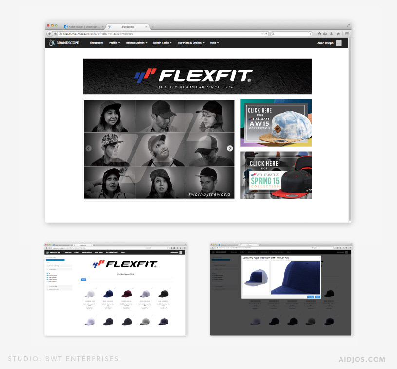
BRANDSCOPE
Digital content and marketing collateral including product photography and lifestyle image creation & preparation (as well as asset management), uploaded to cloud-based B2B eCommerce system called Brandscope. Images were prepared to spec and applied to appropriate areas for end users to access for ordering via Brandscope. I created and implemented all imagery to inclusive of the header graphic, slideshow and button graphics which clicked through to seasonal ranges for which I also during my time with BWT Enterprises had designed and developed ranges for until 2017.

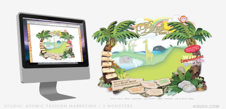
BINDI WEAR INTERNATIONAL
WEBSITE • APPAREL GRAPHICS • BRANDING • 2008 - 2009
Concept and execution of an interactive website for Bindi Irwin & Australia Zoo kids fashion line. As well as developing the graphics for apparel and accessories, my role was to create online interactive media content.The site was creative using HTML, CSS and Flash with Action Script 2.0 for interaction design and animation. Graphics we created and implemented in a cut out animation style.
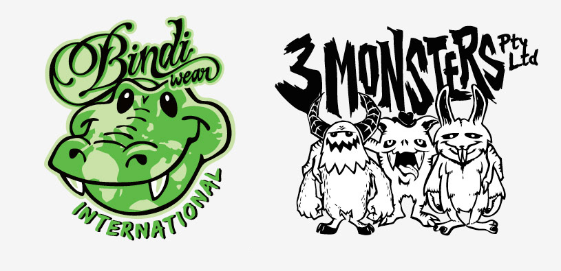
BINDI WEAR & 3 MONSTERS COMPANY LOGOS
Both logos were to be designed with a playful and illustrated look that would appeal to and belong in a commercial youth lifestyle market.

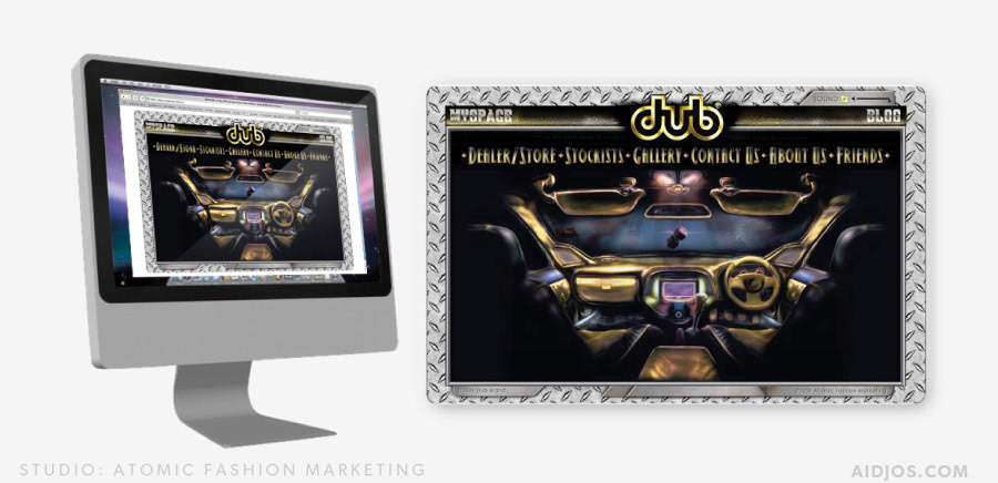
DUB BRAND
WEBSITE • BRANDING • 2008 / 2009
Concept and execution of an interactive website for Dub Brand fashion line. As well as developing the graphics for apparel and accessories, my role was to create online interactive media content. The site was creative using HTML, CSS and Flash with Action Script 2.0 for interaction design and animation. The concept was to create an interface that resembled the interior of a modified vehicle.

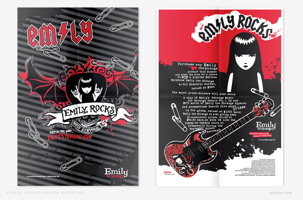
EMILY THE STRANGE
GRAPHIC DESIGN FOR PRINT ADVERTISING • 2007 - 2008
Marketing collateral for youth female directed alternative street wear brand.